Wednesday 8 December 2010

News In Briefs


Rosie, 19, From Surrey
Location: The sun, page 3
The article is about the above woman 'Rosie'.  She is 19 years old and comes from Surrey as stated.  As much as the intellectuals among us would like to think, the main focus of this article is not about a lost tribe in Peru.  No, given existing semiotics the focus is on the half naked female taking over the frame.
The fact that the reaction to the comment in the top right corner is a humerous one signifies that this text is not supposed to be taken seriously.  The reaction is humerous because of the context it is in.  The fact that in our current society a topless page three model is seen as stupid forces this reaction, along with the fact that the majority of people (at risk of sounding presumptious) who buy this type of tabloid and look at the page three models are men who don't care about what women have to say.
The myth communicated in this article is that women are sex symbols/objects to look at and not listen to, this is obvious given that the text is minute compared to the size of her breasts- reflecting the harsh fact that her opinion is unimportant.  The whole article serves the purpose to entertain, both in a sexual and humerous sense, and is deeply offensive to women on every level. 

Tuesday 23 November 2010

Modernist Graphic Design images

1.
Aleksandr Rodchenko.  Design for an advertisement for the Massel' prom (Moscow Agricultural Industry) cafeteria  1923.
2.
Rodchenko.  Maquette for the poster for the film 'Battleship Potemkin' by Sergei Eisenstein.
3.
El Lissitzky.  'From Victory Over the Sun'.  Lithograph on paper. 1923.
4.
Varvara Stepanova.  Poster for the play 'Through the Red and White Glasses'.  Staged by the Academy of Social Education.
5.
Enrico Prampolini.  'Broom'.  1922.

All these five images are of modernist design, and are from that period in time.
The first image is modernist in design because of the shapes used within the frame, along with its clean lines.
The second image because of the perspective used and the shapes used.  
The third because it just uses type layout and numbers- which was the total opposite to designs before its time- this was something new.
The fourth image because of its constructive approach, alongside a heavy emphasis on the role of the woman at that time.
the fifth image, I feel is of a modernist design because of, once again, its constructivist approach.  The type within the frame is also very 'anti design' because of the confusion when reading it. 


The Document

Documentary photography.


The main idea behind documentary photography is to objectively record history as it happens.  But is what we are seeing actually what happened?
From this lecture I have found that unfortunately the majority of this type of photography can't really get away from some form of staging that affects the meaning people gain from it.  I think the quote below sums it up pretty well.
"Still there is something predatory in the act of taking a picture. To photograph people is to violate them, by seeing them as they see themselves, by having knowledge of them as they can never be; it turns people into objects that can be symbolically possessed. Just as the camera is a sublimation of the gun, to photograph someone is a subliminated murder- a soft murder, appropraite to a sad, frightened time."- Susan Sontag, 1979:15.
Something as simple as the camera angle can change the whole mood of a photograph and the way it is received by the viewer, and the photographer can either subconsciously or consciously decide this mood.  Either way, I think it is almost impossible to escape some form of bias when taking an image; and that is why in my opinion documentary photography is not wholly truthful and cannot by fully trusted. 


James Nachtwey is a current example of a documentary photographer.  Nachtwey records events, acting as a 'witness' to them, his idea is that by recording what is happening it highlights these terrible things, hopefully stopping them from happening again.  He states that they "should not be forgotten and must not be repeated", and taking images of these instances is a permanent way to record what has happened.  In his images he places himself right in the conflict, producing photographs that show the true animalistic nature of the subject matter.  By removing himself from the photographs it feels more to the viewer that they are right there, standing in front of this scene- hopefully forcing some form of emotion from them.  For example, the image below, 'Ground Zero', has a very dramatic feel, one that I think has been heightened through photographic techniques- rather than just a plain image of the subject matter.  The camera angle is slightly diagonal, adding to the already fractured landscape.  Also, there is focus on the broken, sharp metal in the foreground which means the viewer will see this first, thus they will have already been influenced on what tone they are going to receive the image in.  This is what Nachtwey wants- he wants viewers to take this is a negative way and force them to react. 
New York 2001, Ground Zero.


William Edward Kilburn.  Another example of an image where the photographer excludes themselves from the image would be this:
'The Great Charitist meeting at The Common'


This image is less about creating an emotion like Nachtwey and more about a true neutral perspective coming from an image-  it is more about fact.  Nevertheless, visual narration in any form is essentially impossible to cut out of an image, however neutral the photographer thinks they are being.  Specifically in this image, the elevated camera positioning gives the image a feel of power through the immense crowds of people, creating a form of tone that has existing connotations for the reader to accept as historical fact.

"How much should documentary photography be concerned with aesthetic, does this focus make it unreal?"
I think that the fact this question comes up shows that it takes away from the authenticity of the nature of a photograph.  When something is emphasised to make a point it takes away from the original idea of revealing truth because it's made to look worse than it is, essentially creating a lie.
Jacob Riis (1888) 'Bandits Roost'

A good example of the above statement would be this image.  The environment is real, yet the scene is not, the people are staged, they have been told where to stand and how to look.  The staged element emphasises the intimidating feel within the image- which is not truthIn essence the image is more powerful because of this so the message is more obvious.  I think perhaps photographers underestimate the viewers' intelligence.


This image is truth, capturing a real moment in time with real emotions.  This style of photography is all about the decisive moment- the most truthful and powerful form of photography.
Even though the image is so real and raw that no exaggeration has to be incorporated, it poses the question: 'should the photographer interviene at these moments when they could be stopping these things from happening?'.

Graphic Design: A Medium for the Masses

Graphic design essentially originates from the beginning of human time, with the first examples coming from cave paintings- communicating stories; images; ideas etc.
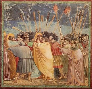
Later in time, in the 1300's when fine art and classical art were all that people knew, the misconception came that these paintings were an expression of the artists love for god and religion, however, this was not the case.  Most of this work was commissioned and therefore holds an ulterior motive.  The image below signifies 'the betrayal' of Jesus Christ.  He, in this painting has blonde hair and blue eyes- even though he is from Palestine and would most likely not have looked this way, the person who commissioned the piece clearly gave direction in this area- much like a client would to a graphic designer.


Later, in the 1800's consumerism was growing because of the industrial revolution.  It meant that there was a lot more choice for products, this meant competition.  This meant advertising.


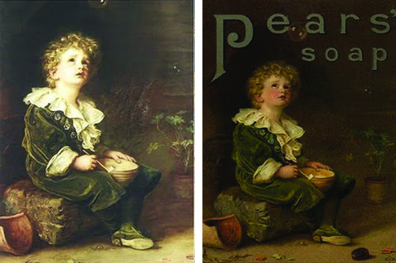
Fine art came hand-in-hand with advertising at this time.  I think the difference between these two pieces is that the text adds meaning, creating communication between the poster and the viewer.  The first image would be known as art, the second piece would be seen as design because it is trying to communicate and persuade the viewer to buy 'Pears soap'.  However, at this time it was difficult to identify what was graphic design and what was fine art because the disciplines seemed to merge together.

After time, a distinction between the two became more apparent.  This was mainly due to the modernist movement, bringing a new way of life that encouraged new design that went against the anti-ornament of fine art.


This specific design was influenced by a modernist painting.  Graphic design still hadn't totally moved away from fine art inspiration, however, the meaning of art had progressed which means graphic designs including art had also progressed.  Which, in turn means that communication had progressed, become more available to the masses because they could understand it.

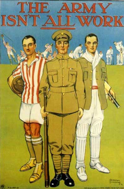
Along with the First World War there was propaganda.  This brought a more sinister form of communication, designers and clients began to adopt a manipulative approach to graphic design.  Take for example the poster below, advertising the army in a positive light, steering clear of the fact that there is a high possibility of death.  However, it is clear that layout and the use of colour within design have progressed for the better at this time.  Perhaps the need to persuade people forced designers to look more closely into the viewers perception of all these aspects, especially because this propaganda was produced to make people feel guilty, there was a need to really understand the phsyche of the people they were trying to manipulate.  


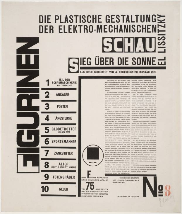
Art started becoming more abstract, so once again, this transferred into other aspects of society, more specifically graphic design.  The geometric style of Kandinsky can be seen in the graphic design of this time.


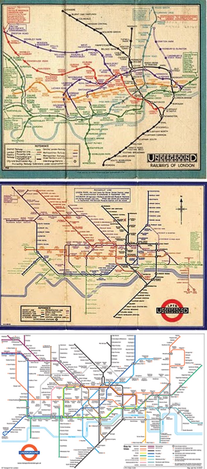
Specifically in Britain, the fine art style disappeared from graphic design, with a totally structured approach.  An example of this would be the first design of the London Underground.  The idea was that it had to be structured because it was designed r the masses- simplicity and function were key.  Over the years as our intelligence and design intelligence has progressed design had developed.  See below.


The Bauhaus set the precedent for design.  Specifically in Europe, design was pushed to the limit and recognised as a discipline of its own.  European design, against British graphic design evolved so much quicker.

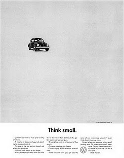
A good example of successful design for a wide audience is the Volkswagen advert below.  The use of negative space draws the viewer in to the photograph, so they see the product being advertised, then the text underneath explains what the advert is about.


Graphic design can raise awareness; persuade consumers; entertain; enlighten.


A more recent example of graphic design, more specifically innovative package design would be this Aphex Twin album cover.  It communicates an image of -as stated below- without actually showing an image of what is being explained.  To me this is a really interesting, original way to promote a product- it gets your attention, whilst being clever, this resonates with the viewer, creating an impact. 


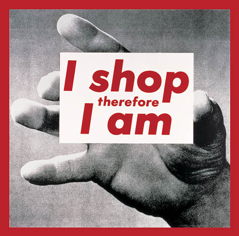
Selfridges 'I shop therefore I am' is one to think about.  It can be read in many ways.  


I like to think it is mocking the shoppers without them realising, tapping into their unconscious rule, their addiction to being a consumer- everything they own defines them, and everything they buy will represent who they are.

Wednesday 10 November 2010

Revolutionary Design in Russia

'Peace, Bread and Land'
It all began in the October revolution in 1917.  The Bolsheviks, led by Lenin began a Civil War within Russia.  They violently opposed how the wealth of their country was being distributed, with sickening wealth in the richer areas and third world poverty in the poorer areas.  


The red in the image depicts communism- 'the blood of the repressed'.  One large person in the middle of the frame holding a hammer symbolises 'the people' as a collective strength.  Because most were uneducated the Bolshevicks had to educate through visual communication.  


Modernity and Modernism

An introduction to 'Modernity' and 'Modernism'.


Modernity:
'The quality of being current or of the present'.
Modernism:
'Practices typical of contemporary life or thought'


In the lecture Richard began with analysing William Holman Hunt, 'The Hireling Shepherd', as a form of the most relevant form of modernity.  The painting was initially seen as an inferior version of a classic ideal.  However, it then became positive, showing that people can do something new and different.  The specific aspect of modernity within this painting is its heightened colour, which seems fairly normal now but in the early 50's of the 19th century this was shocking stuff.


After this the idea of modernism changed, it meant, 'to improve'- loaded with the idea that the modern is better than the old.
A large scale example of this would be Paris.  
Paris, the personification of modernity.
There was modern and ancient side by side i.e The Eiffel Tower and The Louvre.  
Urbanisation kicked in, there was a total shift in the way people lived.  This was partly because of industrialisation.  Rather than people working in the country as a farmer, they would come to the city to live and would work in factories.  The world 'shrank'- new transport systems were created;  roads and railways, along with telephones.  Everything was so much more accessible all of a sudden.  There was the introduction of the standardised world clock, which meant regulated days rather than harvesting times.  There was factory work with shifts and holidays.
There was less of a focus on religion and more on science and technology.  It was a much more secular society.
This changed peoples mindsets, the change affected almost everyone.  Modernity produces fragility, speeds up life and creates distractions that didn't exist beforehand.  Alienation; despair and distraction were the main mental aspects people began to feel.  So obviously there was a lot of criticism over the change .


There was a shift in artists subject matter- there was now a focus on the general 'feel' of modernity, they were portraits of alienation, rather than portraits of people.  i.e In this image by Caillebotte named 'Man at his window', the subject, rather than looking at the viewer is looking out of the image, into the world, the sluggish stance connotes apathy, yet the rest of the frame is filled with impressive architecture reflecting the busyness of the new world.  


Caillebotte is trying to make a connection with the viewer by relating to the world around them rather than specific people- this man, alone at his window is looking out into the world, slightly lost perhaps, confused?- much like the rest of the world were feeling.


The mixed media art form emerged from the hectic life within the world.  For example, this photomontage by Raoul Haussmann (named ABCD) is consistently busy within the frame- using lots of type, image and colour.


I think this reflects how people were feeling at that time.  It is exciting to look at, yet intimidating and busy.  There is an information overload


Also, with the creation of Bauhaus came the idea of form following function.  Lavish cutlery sets that showed off your social status were now seen as unnecessary.  The idea was not to hide what these objects were made out of but to celebrate them- much like the Bauhaus building itself-


It doesn't hide the glass in the windows because they needed a lot of light, or the concrete on the walls to make it sturdy- all the materials used are incorporated into it's design and all the while the form is following the buildings function.


Typefaces such as sans serif were created to increase readability and decrease decoration.  For example the typeface above.  It is very clear to read so here the function is being fulfilled- whilst the form reflects the nature of the building.


Looking back, the idea was to keep looking forward, innovating.  But from this there became a state of mass production, things were (and still are) being made quicker and sold for less.  So, in a way it denies individuality and forces less quality.  However, there is no arguing that without modernity there wouldn't have been such leaps within technology, materials and mental states.